
The decisions
Why it is built the way it is built.
One page, on purpose
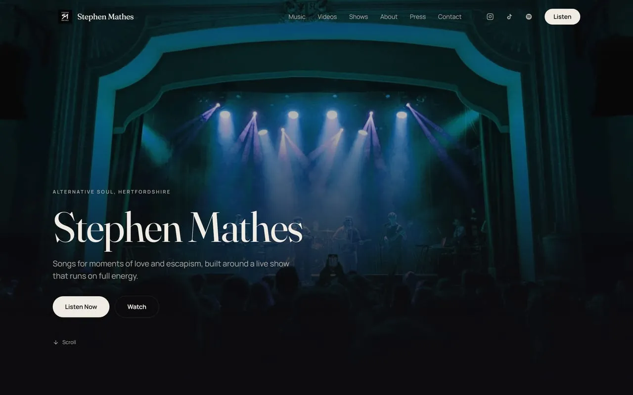
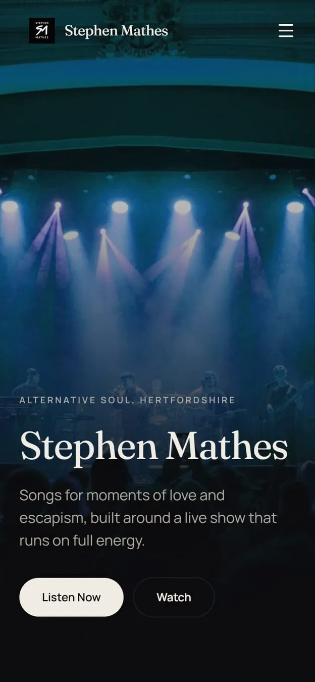
We argue for splitting a site up almost every time, because more pages means more ways to be found. This is the exception that proves why the rule exists. Nobody searches for an artist and then wants a navigation problem. The conversion here is pressing play, and every click between arriving and hearing something is a chance to lose them, so the whole record collection sits on one scroll.
Six records, six colours
The palette shifts as you move through the discography, so each release owns its stretch of the page. It gives a single page the feeling of separate rooms without making anyone navigate between them, and it means an album is recognisable from its colour before you have read its name.
Built to hand off, not to hold on
Spotify, Apple Music, Instagram and TikTok are all one tap away, and the mailing list sits where someone lands after they have already heard something they liked. A musician's site is a junction rather than a destination, and pretending otherwise costs listeners.
Photographs of a room that is in it
Live photography carries the live section rather than a list of dates on a plain background. If the promise is a full band and a room that is in it together, the page has to look like that is true before anyone reads the words.
Are you ready to
Start something worth showing off.
Tell us about the business and we will come back with a free preview of your new site. No cost, no commitment.
Back to top